Welcome!
Today's date is:
05/03/2024
Syndicate

Buick insignia aligned with Buick's history, future
By Casey Williams - MyCarData
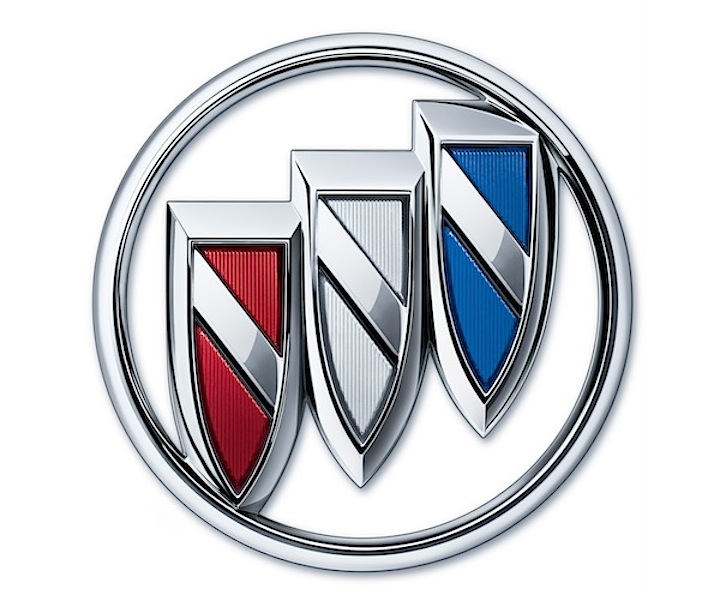
(February 22, 2016) As the story goes, a design researcher at the Detroit Public Library in the 1930s discovered a description of David Dunbar Buick’s family coat of arms. Tracing familial roots to Scotland, the crest included a red shield with contrasting checkered line bisecting it from upper-left to lower-right corners. Designers at GM triplicated the design and created Buick’s logo.
Over the years it has been stretched in different directions, colored red, white, and blue in the 1960s, and most recently, rendered in millennial silver. Buick also used a hawk in advertising during the ‘80s, but the tri-shield returned to prominence and has become one of the most recognizable automotive brands in the world.
To highlight Buick’s new products and future direction, designers went at it for an update. The new shield returns to colors – red, silver, and blue. It debuts on the grille of the redesigned 2017 Buick LaCrosse and will migrate to all other models in short order.
“The new tri-shield insignia represents the next chapter in Buick’s storied design history and introduces a new face for the brand,” said Duncan Aldred, vice president of Global Buick. “It’s a progressive, contemporary design reflective of Buick’s newest vehicles and cognitive of the brand’s heritage.”
From Buick’s founding in 1903 until about 35 years later, Buick had no logo relying on “Buick” script on the grille. And, while silver looked fresh a couple of decades ago, it’s good to see a return to tradition while looking to the future – a perfect complement to Buick itself.